How to Scrapbook Simply and Beautifully - Part 3 / Technique
WHOO HOO! So glad you are ready to learn my techniques for creating simple and beautiful scrapbooks! So how does this design philosophy and system for scrapbooking work? Let’s take a closer look, because I am here to say scrapbooking does not have to be hard!
I have created a few simple rules that I follow most of the time when I create my pages, and now I want to share them with you. To see this process in action, check out this video.
Tip #1: Snap to grid
I want you to think of your pages as having graph paper on them —and then line up your paper, border strips, journal boxes, memorabilia and photos according to that grid. Leave some small white spaces (called eyelines) to define your grid, and presto - your layout is done. This is the basic strategy I use over and over when I create my pages. So simple, right? But so classy and so easy on the eyes! And yet each page is different and unique, and can show your own personal style, by learning the next two tips…
Tip #2: Color Blocking
This was a game changer for me. No more little bitty pieces of paper all over the place. Instead I use large blocks of printed or solid cardstock on my pages to add color and pattern along with decorative border strips, die cut strips, punch borders and sticker strips. There are so many different combinations of sizes and ways of layering with the horizontal and vertical blocks to make your page interesting. This is a huge timesaver, lets you dig in to your paper stash, and leaves your pages looking clean and classic. A quick tip: Cut your paper 1/2” larger than your photo, and you have an instant mat of color!
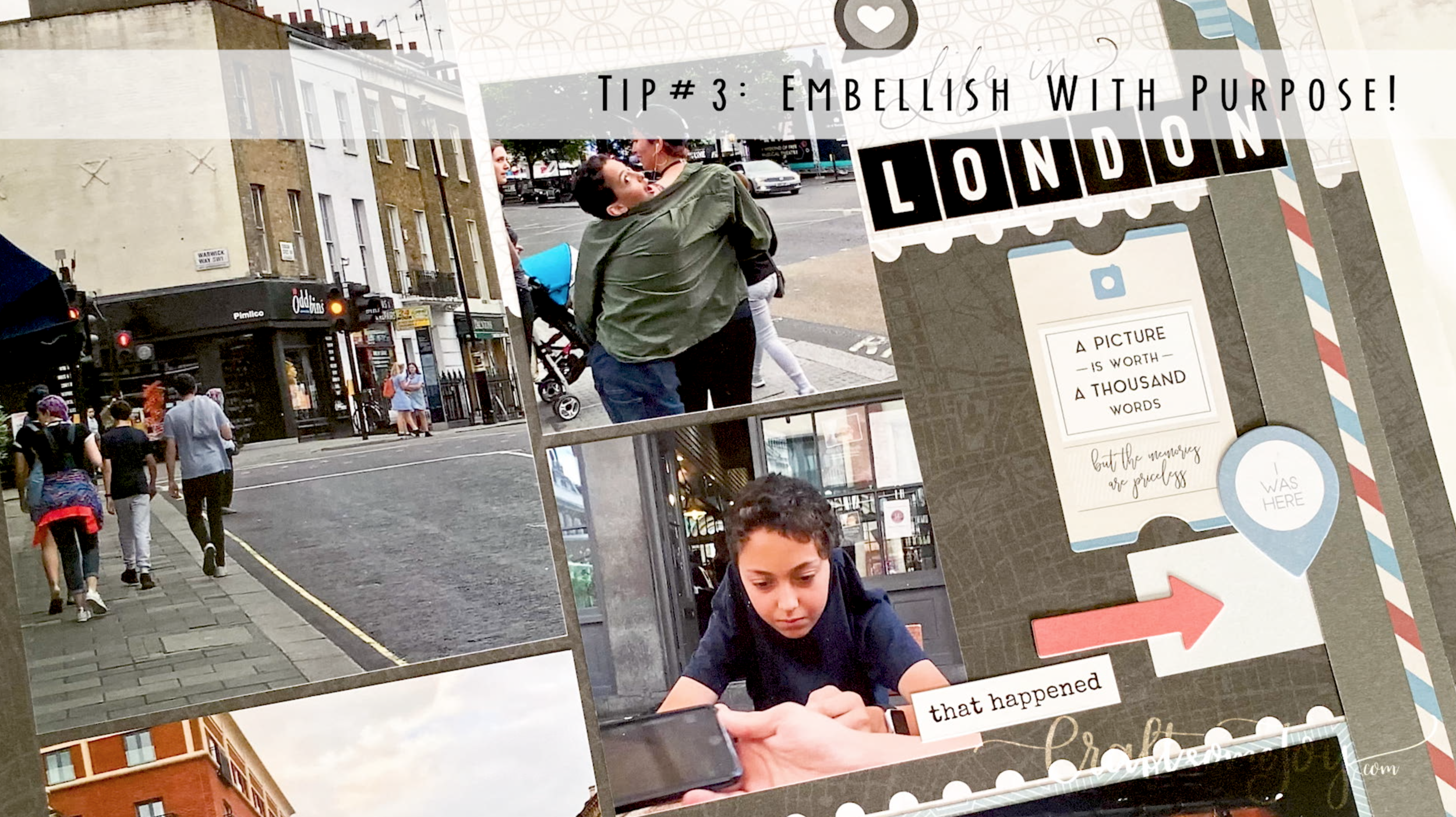
Tip #3: Embellish with purpose!
This is where the fun and crafty can come out to play! This is also where your page can go from simple and beautiful to overwhelming and overdone. There will always be time to make that “special” page that shows just how crafty you can be, but this process is focusing on the technique of getting your pages done. So to do that, remember simple can be beautiful. When it is time to add that special touch, remember a few pointers.
Stickers and accents like to have a “home” and be grounded on your page. Yes, the “sneezing” of stickers all over your page just will not do.
Grouping creates impact, and a place for your eye to rest and notice. This helps whomever is looking at your page to notice what is important, or draw attention to a certain spot on your page.
Clustering in groups of odd numbers are usually more appealing. This is just solid design principle. The odds have it, so remember this in your home, and on your scrapbook page!
So that is it, my technique in a nutshell. Yes, this takes practice. Yes, there is always more to learn, and new things to try. And YES! I will share more right here on my blog.


