10 Design Secrets to Transform Your Scrapbook Layouts
Let's talk about one of my favorite topics: DESIGN
Design matters. Whether you're just starting out or have a shelf full of albums, these 10 scrapbook design principles will help you create more cohesive, beautiful pages that tell your story and look amazing doing it. As a seasoned scrapbooker, I've learned that great design isn't just about throwing photos and embellishments on a page—it's about creating a visual story that captures both memories and imagination. After years of creating layouts, I'm sharing my top design tips to help you take your scrapbooking to the next level.
Remember, you do not have to follow EVERY tip on EVERY layout, but you can pick and choose what you would like to use to enhance your pages! Here's how to use each principle in a practical way.
1. Creating a Strong Focal Point
What is a focal point? It’s the first thing that grabs the viewer’s attention on the page. Centering isn't always your friend. While a large, stunning photo can look great in the middle of a page, most layouts benefit from breaking away from the center. Instead, use the rule of thirds to create more dynamic, interesting compositions.
Tips:
Use contrast (dark/light colors, bold vs. soft elements) to make the focal point pop.
Matting: Place a mat behind a photo/title to draw attention.
Clustering: Group embellishments near the focal point to enhance its impact
2. The Rule of Thirds & Composition
The rule of thirds divides your page into an imaginary 3x3 grid. The magic happens where those lines intersect. When placing photos or key elements, position them at these intersection points. This principle works for both scrapbooking and photography—it creates natural, eye-pleasing compositions.
Tips:
Place the main subject (photo, title) at one of the intersections of the grid.
Arrange embellishments in asymmetrical clusters instead of keeping everything perfectly centered.
Use this principle when cropping photos too—place the subject's eyes or the key action at an intersection point
3. The Power of a Visual Triangle
A visual triangle uses three key elements (colors, embellishments, photos) arranged in a triangle to guide the viewer’s eye. Random scattering is a no-go. Instead, create intentional clusters of embellishments that form a visual triangle across your layout. This guides the viewer's eye and creates a sense of balance and movement.
Tips:
Keep the triangle subtle—it shouldn’t feel forced.
Use elements like word stickers, embellishments, or sentiments to create the triangle.
4. Achieving Balance & Proportion
Balance keeps a layout from feeling too heavy on one side. You can achieve this through symmetrical balance (mirrored elements) or asymmetrical balance (different elements that have equal visual weight). The key to balance is understanding that different elements carry different visual “weight":
Larger elements have more visual weight than smaller ones
Darker colors have more visual weight than lighter colors
Bright, saturated colors have more visual weight than muted tones
Complex patterns have more visual weight than solid colors
Elements closer to the edge of the page have more visual weight than those near the center
Tips:
Mix large, medium, and small elements for visual interest.
Balance heavy elements in opposite corners for a balanced look.
Consider color balance—too much of one color in one area can throw off harmony.
Remember that dark colors and busy patterns carry more visual weight than light colors and simple patterns
Create balance not just with physical elements but with negative space too
5. Coordinating Colors & Patterns
A well-chosen color palette makes a layout feel cohesive and polished. Use color to guide the eye. Create a visual color triangle that leads the viewer through your layout, using your accent or secondary colors strategically. This works across a single page or a two-page spread.
Tips:
Use the 60-30-10 rule:
60% main color: Often a neutral tone (kraft, white, beige, baby blue) used for background paper and large mats
30% secondary color: Used for photo mats, borders, title background, journaling blocks
10% accent color: Used for titles, embellishments, small details (typically the brightest or most vibrant color)
Pull colors from your photos or patterned paper.
Use neutral backgrounds to avoid clashing colors.
Master Pattern Mixing: Not all patterns are created equal. When combining different patterns, think variety -this prevents visual chaos and creates harmony:
One large-scale pattern
One medium-scale pattern
One small-scale pattern
Play with Color Values: Variety is key. Mix light and dark tones to create depth. A quick test? Convert your layout to grayscale. If everything looks flat or muddy, you need more color variation.
6. Thoughtful Photo Cropping & Placement
Not every photo belongs as-is in a scrapbook—cropping can enhance the story! Cropping can be done with printed photos and your Creative Memories Photo Trimmer (in my opinion the best on the market), and digitally with a photo editing program.
Tips:
Crop distractions from the background.
Use a mix of portrait and landscape orientations.
Place the largest, most important photo first, then arrange supporting images around it.
Use odd numbers of photos (3, 5, 7) for a more dynamic arrangement
Mix up your photo styles. This keeps your layouts dynamic and interesting.
Close-ups and wide shots
Horizontal and vertical orientations
Color and black & white images
Action shots with posed photos
7. Meaningful Journaling & Text Placement
Journaling brings memories to life! Journaling transforms a pretty page into a meaningful keepsake by capturing stories future generations will treasure. Your words deserve as much design consideration as your photos and embellishments.
Tips:
If handwriting, use a light pencil guide first.
Make journaling part of the design—try write on stickers, sentiment strips, or dot grid cards with peekaboo pockets.
Answer: Who, What, When, Where, Why for storytelling.
Consider the emotional tone of your layout—should your journaling be playful, reflective, or factual?
8. Layering & Depth for a Polished Look
Layering adds dimension and richness to layouts. It creates dimension that makes elements "pop" and helps establish visual hierarchy—what the viewer sees first, second, and third. Want to draw attention to a specific photo or element? Use techniques like:
Double or triple matting
Applying your accent color
Creating additional white space around the element
Using foam to layer and create “tuckable” areas
Tips:
Layer in odd numbers for visual interest (3 or 5 layers work especially well)
Use materials with different textures (vellum, cardstock, wood) for rich dimension
Create mini-clusters or "layer cakes" under important elements or words
Pop up certain elements with different thickness of foam adhesive while keeping others flat for contrast. This creates “tuckable” clusters.
Use torn edges, layering shapes, or inked edges to add organic texture.
9. Choosing the Right Title & Typography
Your title is both a design element and a storytelling tool. It should complement your photos while helping convey the essence of the memory being preserved. A well-placed title enhances, not overpowers, a page.
Tips:
Use die-cut letters, stickers, or sentiments for variety.
Choose fonts that match your layout's mood (playful script for fun events, clean sans-serif for modern layouts)
Create interest by combining different lettering mediums (stickers with stamps, die-cuts with handwriting)
Make your title interactive with the layout (wrap around a photo, follow a curve, integrate with embellishments)
Don't feel obligated to put titles at the top—they can work beautifully on the side, bottom, or integrated throughout
Use your accent color in your title to help it stand out
10. White Space & Breathing Room
White space keeps a layout calm and visually appealing. "White space" doesn't mean literal white—it's about giving your layout room to breathe. Leave areas less embellished to provide visual rest and prevent overwhelming designs.
Tips:
Leave intentional gaps between clusters.
Resist the urge to fill every inch—empty space is an active design element
Create deliberate "pauses" between photo clusters or embellishment groups
Use white space to frame your focal point and make it stand out
Remember that busy patterns need more white space around them than simple elements
White space creates visual hierarchy by separating different elements or groups
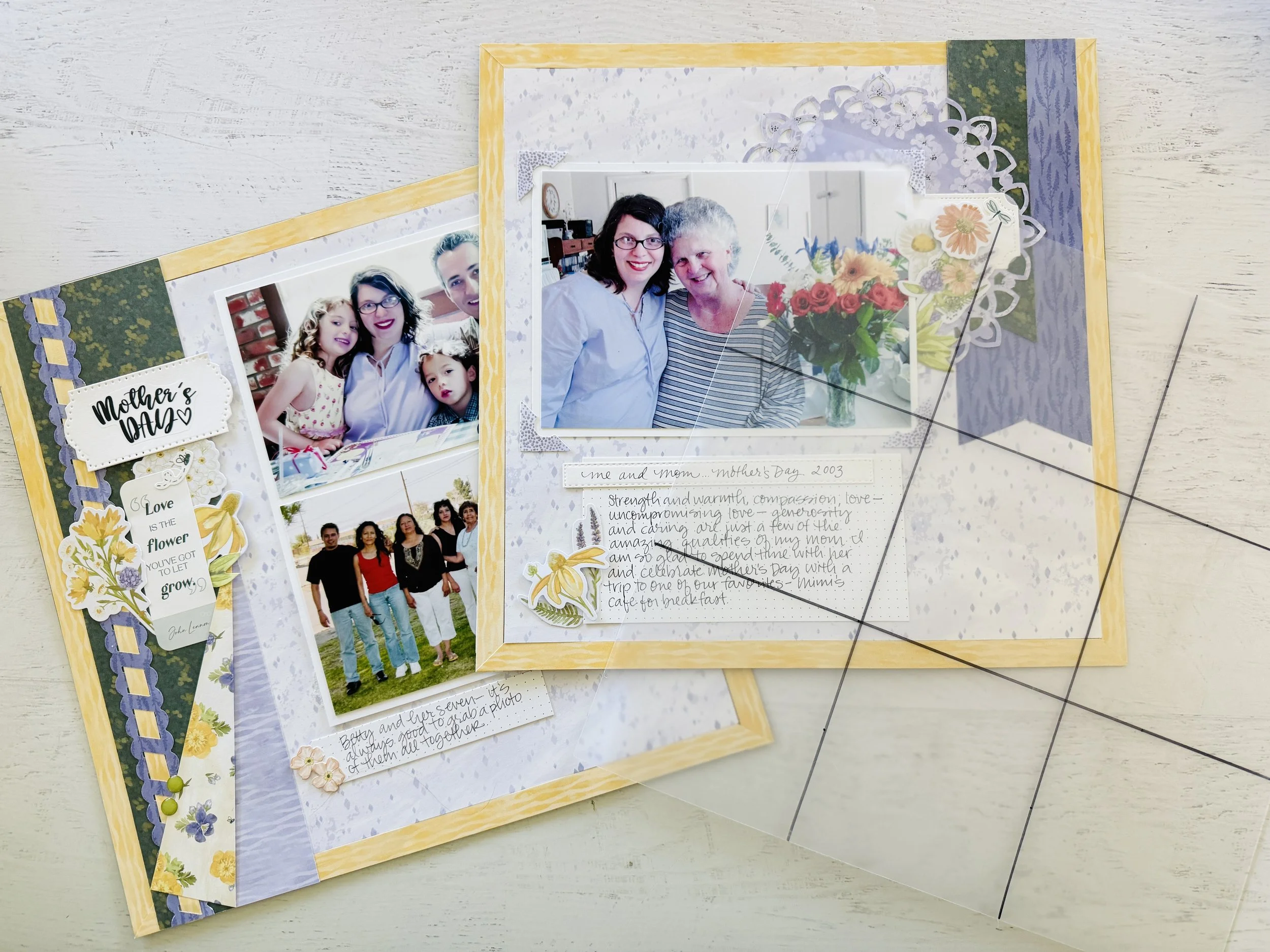
Want to check out the video to see these tips in action? Just click HERE or on the photo below.
You can grab a printable checklist of these tips HERE.
Happy creating my friends!
Need supplies to try out these design tips on your pages?
I would LOVE to be your Creative Memories Advisor, and be the scrapbook store near you - in fact right in your living room! Remember if you shop with me on the Creative Memories Website, you can be part of my rewards program and earn 5% back on your qualifying purchases, or earn FREE gifts when you shop my in-stock inventory on my personal website.


